***The following content was adapted from an article originally on Clairification.com.
_________________________
What if I told you there’s a teensy little digital upsell that could skyrocket your year-end fundraising results? Would that be of interest?
Well obviously it would be.
So here’s something you still have time to do before EOY giving ends.
It has to do with your website, so consider looping in whoever is responsible for that part of your year-end marketing and fundraising strategy.
First, let’s look at a typical Donation Landing Page with a call to action via some compelling text, maybe a photo, and a big, bold “Donate” button. Hopefully you’ve optimized it for mobile too. And, no matter what device your donor uses to access the page, they’re able to complete their gift with no more than two clicks. Check, check, check, check and check.
You’re well on the way (or not quite) to getting some nice traction for your campaign.
But… don’t stop there!
Because you can significantly boost your results if you add one simple thing.
It’s called a LIGHT BOX.
This is also sometimes called a splash page (because when someone visits your website it ‘splashes’ up onto their screen with an important message). It’s a form-based box that literally “lights up” the screen to shine a light on whatever message is your SMIT (single most important thing) at that point in time (some folks also call this a shadow box, pop-up, or high-jacking).
Wait… you say you don’t like ‘pop-ups?’ It’s not about what you like. It’s about what works. And they do work. Per Sumo, an average pop-up, converts visitors to buyers at 3.09%, and the best around 9.28%. With 100 site visitors a day, that’s an extra 92-274 conversions per month. Nothing to sniff at.
At the end of the calendar year, usually your message will be a donation call-to-action. It usually pops up the first time folks come to you for the period for which you set it up – perhaps once/day during the four to six weeks you’re running your year-end campaign. [The best advice we’ve heard is if your visitor dismisses the popup, don’t show it to her again for at least a week].
Again, you or your leaders might find them annoying. But they work. And they work especially well for targeted campaigns like the end of the calendar year. Your conversion rate from prospect to donor goes up with a light box because more people will see your call-to-action. They can’t help but notice it, because you’ve put it right in their faces.
We’ve worked with nonprofits where end-of-year giving went up more than 30% just from adding a LIGHT BOX, and we’re talking about something that takes less than an hour to build by your web developer.
In case you need a few visual references of a LIGHT BOX done well, here you go!

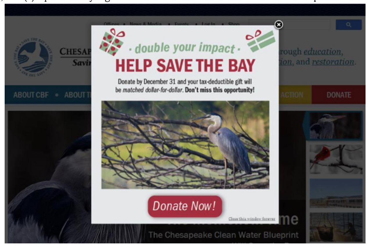

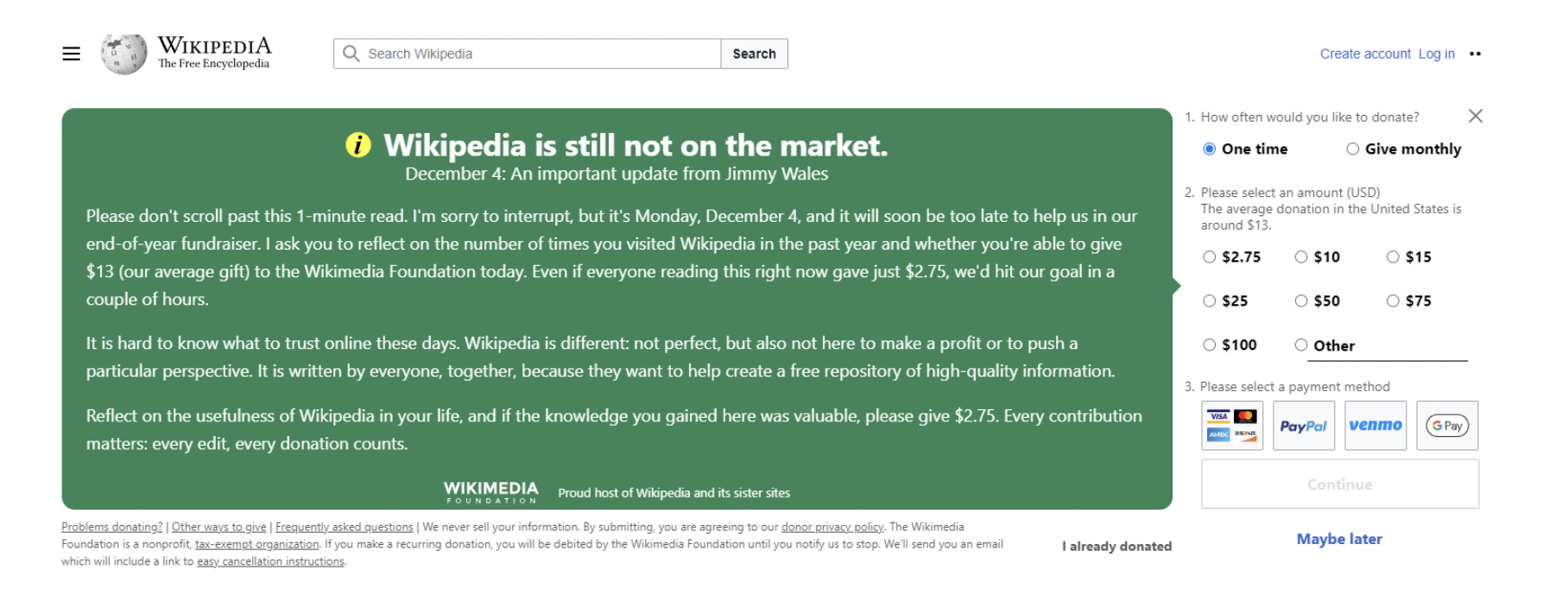

Carefully crafted, Light Boxes can create more pleasure than displeasure.
Whatever you do, track your results. Don’t be swayed by isolated complaints. It’s overall performance that matters. If your bounce rate spikes, you can always tweak things and perhaps slow down the number of times the Light Box pops up. Or you can try a different message, design and/or call to action. Light Boxes are a great opportunity for A/B testing.
Ultimately, as they say, the proof is in the pudding. If you find you’re receiving more gifts, this is something you’ll want to continue.

